REDESIGNING THE LOGOS AND MAKING POP ART ALBUM COVERS (Week 1)

Sophie and I then went away and recoloured the logo’s. We decided to try and slightly adapt it as well; taking out border lines, removing the star etc. We didn’t want to actually design a new logo, as we felt it wasn’t really our place to create a new logo for the night. Lollipop has been running for 15 years or so, and we wanted to respect that by keeping the logo, and only slightly editing it.

We decided, with input from the group, on a colour palette that would be used at the very least for the logos. These colours consisted of classic bright pop art/neon colours that fit our theme.

colour palette

I then proceeded to recolour the logo using this colour palette. There were a few differences in the group as to what colours were best, as pop art as a theme has a huge variety of colour. However, we decided to refine the various colours to those that were most contrasting and appropriate (for example leaving out orange, as it was very similar to yellow, and using red as it is a common colour of lipstick, a major theme in pop art).

This slideshow requires JavaScript.

I also had a test in Photoshop, and redesigned the ‘Abbey Road’ album cover. I did this not only to see what it would look like ‘pop art-ed’, but also to practice with Photoshop itself. I haven’t used the software an awful amount, and I want to get better at using it. I enjoyed creating the covers, and learning more of the software; for example, I couldn’t initially change the hue/saturation to make it look pop arty, but learnt how to. I really enjoyed creating the covers because I learned new techniques (even if the covers won’t be used).

I’m looking forward to tomorrow (Monday 8th), and to recolouring the logos.

MEETINGS (Week 1)

MEETING 1:

When we met as a group, my ideas were not met with overly positive response. Many of my group had the same worries as I did; that there was too much of a story. They came up with an excellent point that if we were to have a long clip that transitioned, it would perhaps not fit the mood of the night. For example, if people didn’t see the ‘start’ of the clip, or if the music suddenly changed, or if the beat dropped, then it would be hard to adapt our content and keep it appropriate.

After hearing all the ideas, we concluded that we definitely wanted some props, such as lava lamps and old style television sets. Nancy said she would ring the scrapyards, so hopefully we will be able to use televisions in our live setup.

The idea for the televisions came from Stephen. He had the idea that we could use actual old school television sets and wheel them onto the stage and them project into them. All of the group were a little worried at the practicality of the idea, but we managed to try and figure out how we could potentially do it. At the moment it is more of a concept for the staging element of the brief, but one that would work really well with the themes we’ve come up with so far. I’m excited to see what we can do with the idea in the next few weeks.

Sophie then came up with our first solid idea; a ‘Where Are Ü Now’ inspired take on the lollipop logo.

The idea is that we will get students from BU (who are also the people that go to lollipop on a Friday) to redesign/colour in/go mad with the lollipop logo. We will then string these together and make a video that flashes through all the logos. We all really liked the idea, and the fact that it is created by the people that will be at Lollipop, something that makes it a bit more personal to BU and the event itself.

We also had issues decided who was going to be our projection mappers. I wanted to do it initially, but after seeing how many others wanted to, I decided that I wouldn’t. We drew names from a hat in the end, and Fabi, Luke and Stephen were chosen. Though I can’t projection map, I am happy that I am now a part of the creative team (with Sophie, Andrew and Antonia), because I have often been on the software/technical side of projects before (such as being a coder or production manager). I’m excited to be able to run free with ideas, and hopefully push my creativity.


MEETING 2:

When we met again, we confirmed that having many different smaller clips that could be used interchangeably would be the best way forward. Members of our team showed us some pop art style vjing that seemed to fit the theme of lollipop well, as well as discussing ideas for shoot days. At this point we are still getting our bearings with how broad the brief is, so we just decided on some rough ideas that we could begin to work around.

It was then decided that Sophie and I would create some variations of the lollipop logo that we could all print and bring with us on Monday to be coloured by students.

MY RESEARCH (Week 1)

I decided to do some basic research on the concept of vjing before starting to think of ideas. As mentioned previously, I had a hard time shaking the idea of having a story, so one of the ideas I came up with was a trip through different decades. The lollipop logo would transition between the 80’s, 90’s, 00’s and maybe even the 2010’s, with the logo remaining constant.

We had also discussed previously that we wanted to try and do a ‘pop art’ theme. This meant that the other side of my personal research came from researching pop art and its roots. I started with well-known artists such as Andy Warhol and Roy Lichtenstein, and thought about how I could incorporate the themes into the decade span idea.

First Image (Andy Warhol) | Second Image (Roy Lichtenstein)

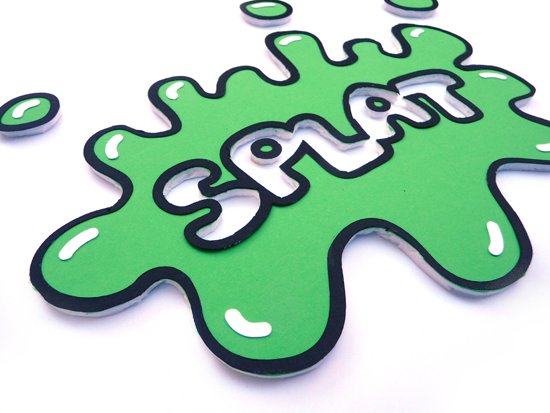
I realised that it may be easier said than done, as ideas that I had in my head were probably far harder to create, as many of them would require green screens and digital effects. These are a couple of examples of the decade idea. The 90’s theme would be inspired by image 1, with the word ‘lollipop’ instead of ‘splat’, and would be neon coloured. The 80’s theme would be similar to video 1, with a logo perhaps hanging as an air freshener inside the car. (These ideas would then be bulked out with more content).

splat-detail2.png
Image 1


Video 1

THE FIRST DAY (Week 1)

We began our Stories and Spaces unit in the fire station. The brief itself was difficult at first to get our heads around, as it was much different to anything we had done before. I think the concept of not creating something with a story was my biggest challenge; it was hard to visualise content that didn’t have narrative so to speak. As a result, many of my initial ideas still loosely revolved around having a narrative, something that as the week progressed I found easier to cope with.

Beyond being given the brief, we all had a chat on the Monday about what we could create for the project, and why. We were shown around the different areas of the fire station that we could create content within, and after discussion decided that the main room was probably best for the project. As a group we felt that it was an easier space to work in, as well as there being a larger footfall of people that would see our work (as people almost have to walk through the main room to get to the other rooms, especially then engine rooms). I am very excited about the concept of creating something in a real space, and with the freedom that the project gives us in terms of creativity.

We then decided to meet on the Tuesday after we were handed the brief to meet and discuss ideas. We all agreed that we would try and bring three ideas or concepts each, so we could hit the ground running.